- Poker - Recording Games
- Poker - Tracking cards
- Poker - Table top
- Poker - Chip
- Poker - API
- Poker - Stats
- Poker - App
- Poker - Docs
- Poker - Hud
I'm back to working on the Poker Web App, as you saw from the original post the UI is lacking somewhat.

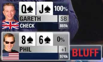
I've taken some inspiration from live shows and started working on implementing the styles in the app. I've found a number of variations I can work through, so here's the first attempt.
This led me to creating a shared Microsoft.NET.Sdk.Razor project called Poker.Components. (I should have done this with the original components).
I've made a start on the first Board:


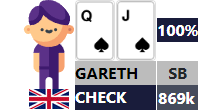
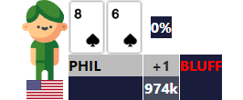
Players:


And Pot:


Thanks for the card images @danielpaz6 in Texas holdem Rank Card Evaluator
With this shared Library it means I can try it out in both my Blazor WASM app (that I have deployed on GitHub Pages), and my Blazor Server app which I'll be using as the main app.
See the current progress at
One very helpful tool I used to layout the Players was Layoutit!, which is a CSS Grid Generator.
I copied the initial output to codepen before moving to my Blazor app.
Track it via